A Color Darker Than Black

PRESS RELEASE

The Browsing Room Gallery at the Downtown Presbyterian Church is pleased to present A Color Darker Than Black by DPC resident-artist artist Sarah Shearer.

Exhibit title: A Color Darker Than Black


Exhibit Dates:

April 7 – May 24, 2018


Receptions:

Saturday, April 7, 6 – 9 pm in coordination with the downtown art crawl and 5th Avenue of the Arts.

Saturday, May 5, 6 – 9 pm in coordination with the downtown art crawl and 5th Avenue of the Arts. 


Artist’s Statement:

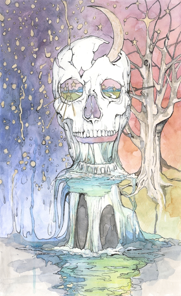
Black is the darkest color resulting from the absence or complete absorption of light. With this body of work, Shearer explores her experience with depression, trauma and loss while searching for peace and freedom. The idea of a color darker than black exemplifies the weight of mental health struggles. In her new work, the preservation of negative space and incorporation of a lighter palette tells the story of where the artist is currently at: very consciously pushing back against the absorption of internal light. Using a combination of water-based media on paper, representational, yet dream-like images are Shearer’s storytelling vehicle. These images are rooted in personal memories and dreams, a compelling contrast of loveliness and darkness. This narrative is how she describes her understanding of peace. That a willingness to accept — rather than avoid — the frightening, fearful parts of life cultivates the possibility of a more beautiful future.


About the artist:

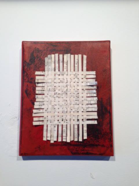
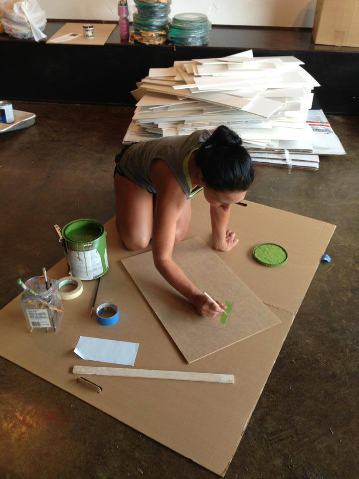
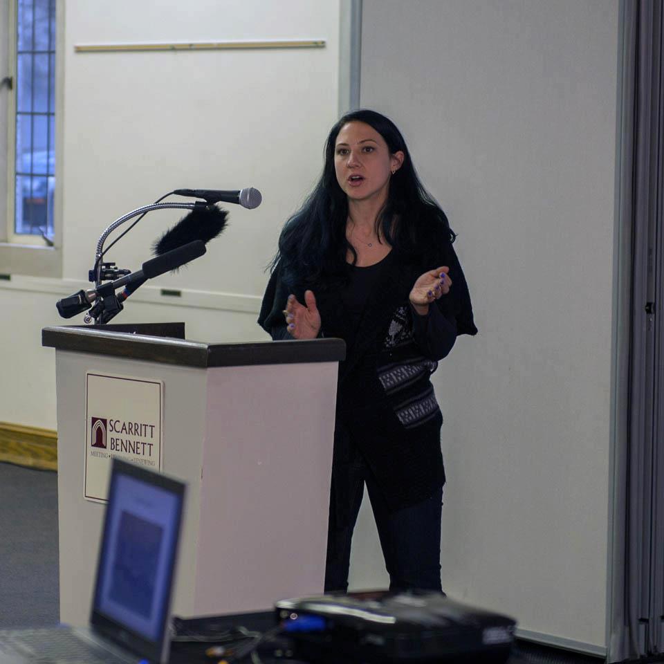
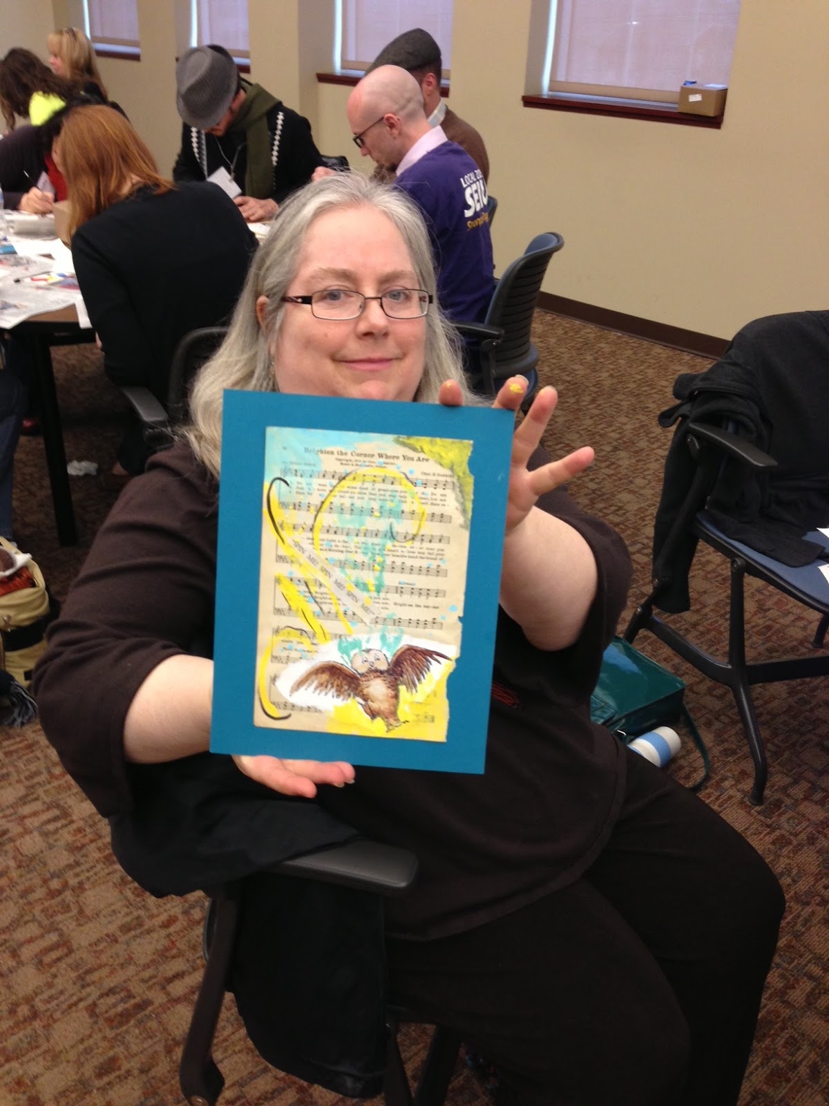
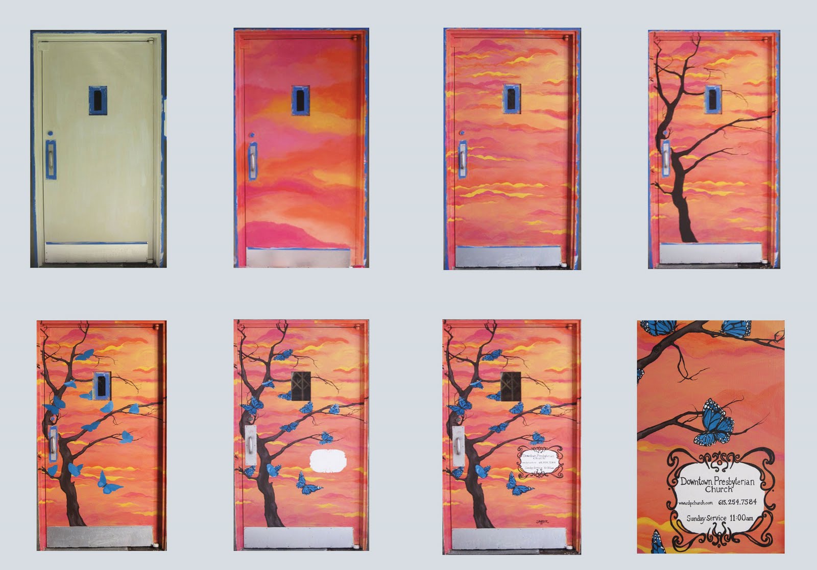
Sarah Shearer received a Bachelor of Fine Arts in Painting from Belhaven College in Jackson Mississippi. Immediately following, she relocated to Nashville, Tennessee. Shearer has exhibited her work locally, in both solo and group exhibitions. She has been a resident artist in the Downtown Presbyterian Church studios since 2009. Shearer works primarily as a painter, but periodically challenges her creative practice by working in a range of other mediums such as print making, ink/ graphite on paper, mixed media, and textiles.

Images: The Gift, 2018, 11 x 18 inches, Watercolor and ink on paper

The Gift.11x18.jpg

Turnip Green Creative Reuse #FBF

#FBF and #ThankfulFriday shoutout to a local arts nonprofit doing great work in the Nashville community, Turnip Green Creative Reuse (TGCR)! Their mission is "Fostering creativity and sustainability through reuse". TGCR fulfills that mission through 4 areas of service, as described on their website: 

A retail donate what you wish ($) store, education/outreach, artist support, and a green gallery. It provides a welcoming and neutral place for artists, educators, and any creative person to connect. We hold a high priority to serve the art community as well as work with children in our community, bringing them ways to create from what they see going in the trash everyday.

Over the years, I've enjoyed many opportunities to parnter with TGCR. The pics above -from left to right- show a piece I created from upcycled materials and contributed to a TGCR benefit show, painting their logo on signage for doorway, and presenting my work at NashvilleNext speaker series, during topic discussion on "sustainable urbanism & community livability". TGCR was featured as a local org supporting sustainable culture; I showed and spoke about artwork I have used recycled materials in.


Another great experience partnering with TGCR, leading a workshop for Metro Nashville Public Library, is pictured above. On staff retreat days MNPL invites local organizations to put together a variety of educational workshops and let employees choose what they would like to attend.

Turnip Green Creative Reuse was one of the local organizations selected to put on a workshop during a staff retreat. The reuse art project I led centered around book art- being for the library- it seemed like a natural fit!

I'm so thankful that Nashville has such a great oganization working to keep the community creative and sustainable. If you're in the area be sure to check out their brick and mortar shop in East Nashville!
 

Mary, Mother

Mary is a deeply personal piece; the process of painting it was a prayer.

I completed most of the work on this in May, the month of Mother’s Day. I was intrigued by Mother Mary as an icon. Probably the most recognizable Catholic iconography in this is the Immaculate Heart of Mary. It represents her joys and sorrows, her virtues and hidden perfections, her maternal love for her son, her compassionate love for all people, and, above all, her virginal love for God the Father. 


Although I am not Catholic, I found the symbolism powerful:

Posture

The body is rendered with a gentle dignity befitting a temple of the Holy Spirit. The holy person is in the presence of God, yet turned towards us. As we pray he is very present to us not somewhere out in space. “The art of the icon is essentially a witness to an eternal presence, and each holy person like a sacrament of divine beauty.” (St. Clement of Alexandria).

Clothing

The folds of garments, rendered in rhythmic order, are in some way an image of the inner harmony of the soul and body of the weaver. Leonid Ouspenski calls them ‘Vestments of Glory’.

Hills 

Hills, so often mentioned in the Bible, especially in the Psalms, are always holy places – a place of ascent to God. In icons, to help this ascent the hills are stepped, and as a further help, each step is lighted for us. “The icon evokes a personal presence, and its symbolism shows this presence and the cosmic situation around it to be saturated with divine light.” (St. Clement of Alexandria)

Perspective

In icons the illusion of distance and size in the perspective of Western art is reversed, so that as we go deeper into the icon, away from our own view point, our spiritual perspective widens; we have the capacity of spiritual growth.

Perspective

In icons the illusion of distance and size in the perspective of Western art is reversed, so that as we go deeper into the icon, away from our own view point, our spiritual perspective widens; we have the capacity of spiritual growth.

The above is from THIS SOURCE

As I was working on this I was listening to a lot of Patty Griffin, especially her song “Mary,”about Jesus’ mother as an archetype of loss.

How it becomes personal is in my story of motherhood. Although I planned to never have children, and was on birth control, years ago I (and my husband) got pregnant anyway. Shock of a lifetime, let me tell you. To make a VERY long story short, I chose to place him with an amazing family via open adoption. We (myself, Jon, the adoptive family) spent many months during the pregnancy getting to know each other, discussing expectations, and planning for this baby’s future. Open adoption means we are present in his life and communication between us all is very open. Over the years we have grown to become true family. It is one of the most beautifully unique things I never imagined I’d experience. I’d be lying though if I didn’t tell you that pregnancy and the first year or so after weren’t overwhelmingly painful. I hoped my decision would lead to joy, but the road to getting there was letting myself experience inestimable loss. I’m so thankful for it all though. He changed me for the better. His adoptive family fills my life with love. He is an amazing young man. I find comfort from those feelings of loss when I see the vibrant life and love that has grown from it. Oh, and I have no illusions of virginal sainthood :)

Mary you’re covered in roses, you’re covered in ruin
You’re covered in secrets
Your’e covered in treetops, you’re covered in birds
who can sing a million songs without any words
— Patty Griffin

Nashville Public Art

Years ago I did a small mural project on an elevator door.

Yesterday I was googling my name - like you do- and stumbled across NashvillePublicArt.com's blog post about it! 

Click HERE to read. Peep images below to see the process!

We delight in the beauty of the butterfly, but rarely admit the changes it has gone through to achieve that beauty.
— Maya Angelou